Quick Answer: What Makes a Thumbnail “Perfect”?
A perfect YouTube thumbnail is not the most beautiful design — it is the most clickable visual in a competitive environment.
On YouTube, your thumbnail must:
- Interrupt scrolling behavior
- Trigger emotional curiosity
- Clearly communicate the video’s promise.
- Stay readable on a small mobile screen.
If it fails at any of these, your Click-Through Rate (CTR) drops — and distribution slows.
The algorithm rewards attention.
The thumbnail earns attention.
Table of Content
The Impression–Click Gap: Why Good Videos Get Ignored
Most creators believe video quality drives growth.
In reality, growth starts before the video plays.
Every time your video appears in:
- Search results
- Suggested videos
- Homepage recommendations
It receives an impression.
If users click → CTR rises → YouTube expands reach.
If users ignore → YouTube reduces testing.
You usually have under one second of eye-tracking time while someone scrolls.
This is the “Impression–Click Gap.”
A 10/10 video with a weak thumbnail will lose to a 6/10 video with a strong visual hook.
Your thumbnail is your distribution engine.
The Psychology Behind Click Decisions
Before we talk about fonts and colors, we need to understand human behavior.
People click because of:
- Curiosity
- Emotional tension
- Visual contrast
- Anticipated reward
Your thumbnail must create a micro-question in the viewer’s mind.
For example:
Bad:
“How to Grow on YouTube”
Better:
Face shocked + text: “0 → 100K?”
The second creates a curiosity gap.
The thumbnail should start the story.
The title should complete it.
This alignment increases CTR and improves viewer satisfaction.
The 5 Core Design Principles of High-CTR Thumbnails
1. Subject Separation (Depth & Focus)
The human brain detects contrast instantly.
If your subject blends into the background, your image becomes noise.
Ways to create separation:
- Add a white or black outline (4–10px stroke)
- Blur the background
- Darken the background
- Increase brightness on the subject only.
- Desaturate the background slightly.
Professional thumbnails exaggerate depth intentionally.
2. Color Strategy & Saturation Gaps
YouTube’s interface is primarily white or dark grey.
Muted thumbnails disappear.
Use:
- Bright yellow
- Vivid red
- Cyan
- Neon green
- High contrast purple
But don’t randomly choose colors.
Use a Saturation Gap strategy:
Look at the top-ranking thumbnails in your niche.
If most use blue, try orange.
If most are dark, try a light contrast.
You don’t want to blend in — you want to differentiate.
3. Emotional Signal Density
Faces convert because humans are wired to respond to expressions.
High-performing emotions:
- Shock
- Surprise
- Intense focus
- Frustration
- Celebration
Avoid neutral faces.
If using a face:
- Crop close (shoulders up)
- Increase sharpness
- Enhance eye brightness slightly.
Faces act as visual anchors.
4. Simplicity: One Subject + One Outcome
Clutter reduces clarity.
Weak thumbnail:
Face + arrow + 5 objects + 6 words + busy background.
Strong thumbnail:
Face reacting to one clear result.
The rule:
If it requires explanation, simplify it.
5. Hierarchy & Eye Direction
Guide the viewer’s eye.
Use:
- Arrows (sparingly)
- Light direction
- Subject gaze pointing at text.
- Color contrast blocks
Design is about control.
Your thumbnail should tell the eye exactly where to look.
Typography Science: Fonts That Survive Mobile Compression

Over 70% of views happen on mobile devices.
Your thumbnail may appear at a 2–3 cm width.
The 5% Zoom Test
Zoom out until your thumbnail is very small.
Can you read it instantly?
If not, reduce text or increase font weight.
Why Bold Sans-Serif Fonts Win

Fonts like:
- Impact
- Montserrat Extra Bold
- Bebas Neue
Work because:
- Thick strokes improve legibility.
- Minimal detail survives compression.
- Straight lines remain sharp.
Avoid:
- Script fonts
- Thin fonts
- Decorative typography
Text Color Psychology
Best combinations:
- White text + black outline
- Yellow text + dark background
- Red text + white stroke
Always separate text from image.
Add:
- Drop shadows
- Outer glow
- Background box overlay
Use a maximum of three words.
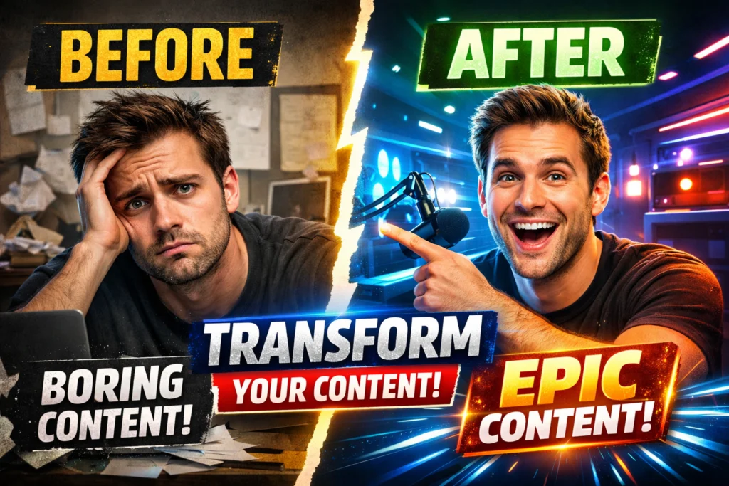
The 7 High-Performance Thumbnail Layout Archetypes (Deep Breakdown)
1. Before vs After

Best for transformation niches:
- Fitness
- Editing
- DIY
- Business growth
Structure:
Left side = problem
Right side = solution
Add clear visual contrast between sides.
2. The Result Shot
Show the finished outcome.
People click results, not process.
Examples:
- Revenue screenshot
- Finished gaming setup
- Final edited image
Keep the background minimal.
3. The Comparison (A vs B)
Ideal for:
- Tech reviews
- Software comparisons
- Strategy breakdowns
Use symmetry.
Add “VS” for conflict clarity.
4. Emotional Reaction

Face reacting to something unseen or partially visible.
Curiosity builds because viewers want context.
5. Close-Up Object
Zoom into one powerful detail.
Perfect for:
- Gadgets
- Tools
- Product features
Clarity > complexity.
6. Mystery Blur
Blur one element intentionally.
The title reveals what’s hidden.
Use carefully — avoid misleading visuals.
7. Conflict Split
Old vs new.
Cheap vs expensive.
Success vs failure.
Conflict drives decision-based clicks.
The Professional Thumbnail Production Workflow
Professionals do not design randomly.
They follow a system.
Step 1: Plan the Thumbnail Before Filming
Capture high-resolution photos during recording.
Don’t rely on random video frames.
Step 2: Cut Out the Subject
Use background removal tools.
Clean edges increase professionalism.
Step 3: Color Grade Strategically

Increase:
- Contrast slightly
- Saturation moderately
- Sharpness subtly
Avoid over-processing.
Step 4: Add Text with Hierarchy
Place text opposite the face.
Avoid covering key elements.
Step 5: Add Branding
Optional but powerful:
- Small logo
- Consistent background style
- Repeating color scheme
Brand recognition increases long-term CTR.
The Competitive Research Method (Reverse Engineering)
Instead of guessing, analyze.
Search for your keyword on YouTube.
Study the top 5 thumbnails.
Look for:
- Common color choices
- Text positioning
- Facial expressions
- Object placement
Download YouTube thumbnails in HD, then use your research workflow.
Study structure — not style.
Differentiate strategically.
A/B Testing Framework for Thumbnails

If CTR is low:
Wait 24–48 hours after publishing.
Change one element only:
- Subject image
- Text phrase
- Text color
- Emotion intensity
Monitor CTR change inside YouTube Studio.
Repeat systematically.
Improvement compounds over time.
Advanced CTR Strategy: Title–Thumbnail Alignment
Your thumbnail should not repeat your title.
Instead:
Thumbnail → raises curiosity.
Title → clarifies value.
Example:
Thumbnail: “$0 → ?”
Title: “How I Made My First $10,000 on YouTube”
This creates narrative tension.
Avoid redundancy.
5 Critical Mistakes (With Solutions)
1. Cluttered Background
Fix:
Apply a Gaussian blur or dark overlay.
2. Too Much Text
Fix:
Reduce to one phrase.
3. Low Resolution
Fix:
Export minimum 1280×720.
4. Misleading Clickbait
Fix:
Thumbnail should tease — not lie.
Misleading visuals reduce retention and harm algorithm trust.
5. Inconsistent Visual Identity
Fix:
Create a style guide:
- Same font family
- Similar color tone
- Recognizable layout
Consistency builds brand memory.
Tool Comparison: What Should You Use?
Canva
Best for beginners.
Easy templates.
Limited advanced control.
Adobe Photoshop
Professional level.
Full creative control.
Steeper learning curve.
Photopea
Free browser-based Photoshop alternative.
Good for intermediate creators.
Best approach:
Research structure first.
Then design intentionally.
Tools are secondary. Strategy is primary.
Technical Standards (Official Requirements)
According to YouTube:
- Resolution: 1280 × 720 minimum
- Aspect Ratio: 16:9
- File Size: Under 2MB
- Format: JPG or PNG
Higher resolution improves clarity on large screens.
Long-Term Branding Strategy
Your thumbnails should become recognizable over time.
Consistency builds:
- Trust
- Recognition
- Faster clicks
Create:
- A repeating color theme
- Consistent text placement
- Familiar composition style
You are not designing one thumbnail.
You are designing a visual brand.
Founder Insight (Experience-Based Observation)
From analyzing the downloaded thumbnails across niches, one pattern is clear:
Small channels benefit most from simplicity and contrast.
Complex designs may work for large brands — but clarity wins for growth channels.
Focus on:
- One subject
- Strong separation
- Clear message
That alone can significantly improve CTR.
Frequently Asked Questions
What is the best YouTube thumbnail size?
Can changing thumbnails revive old videos?
Yes. If CTR improves, YouTube may test your video again.
Should every thumbnail include text?
No. Only if it improves clarity.
Do emojis help?
Sometimes. Use sparingly.
Final Thoughts: Think Like a Strategic Operator
Making the perfect YouTube thumbnail is not about creativity alone.
It’s about:
- Behavioral psychology
- Contrast engineering
- Competitive research
- Mobile optimization
- Strategic testing
When you combine structure, research, and clarity, thumbnails become growth assets instead of random designs.
This is how you move from guessing…
to operate strategically.
Absolutely impressed with the quality of the YouTube thumbnail! It was eye-catching, well-designed, and perfectly aligned with my video content. The colors, fonts, and layout really made it stand out. Highly recommend for anyone looking to boost their video clicks with a professional touch!
Thanks for the kind words!
Great post! 🎯
Thanks for the kind words!
Great post, well explained!
Thanks for the kind words!
Great post!
Thank You!