You’ve spent hours creating the perfect video. You’ve edited it, optimized the description, and you’re ready to share it with the world. But when you publish, you’re met with… crickets. Few clicks, low views. YouTube Thumbnail Mistakes?
Often, the culprit is hiding in plain sight: your thumbnail.
Your thumbnail is the single most important factor in a viewer’s decision to click on your video. Even the best content will fail if its packaging is flawed. The good news is that most underperforming thumbnails suffer from a few common, easily fixable mistakes.
In this guide, we’ll break down the 7 youtube thumbnail mistakes design and show you exactly how to fix them to boost your click-through rate (CTR) and grow your channel.
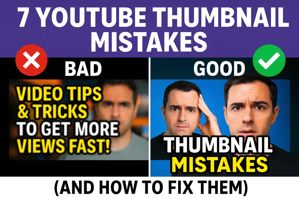
Mistake 1: Unreadable or Overcrowded Text
This is the most common mistake new creators make. They try to fit the entire video title onto the thumbnail using a small, hard-to-read font. Remember, most people will see your thumbnail on a small mobile screen.
- The Problem: The text is too small, the font is too fancy, or there are too many words.
- The Fix: Use 3-5 powerful, high-impact words in a bold, clean font (like Impact, Bebas Neue, or a bold sans-serif). Your goal is to spark curiosity, not provide a summary.
Mistake 2: Low-Quality or Blurry Images
A blurry, pixelated thumbnail screams “amateur.” It instantly reduces your credibility and makes viewers assume the video quality will be just as poor.
- The Problem: Using a low-resolution source image or a poorly cropped screenshot.
- The Fix: Always start with a high-quality source photo (at least 1920×1080 pixels). When you need to adjust its size for your design, use a tool that maintains quality. For example, if you have a large photo, using Image Resizer can help you resize it perfectly without losing sharpness.
Mistake 3: Poor Contrast and Dull Colors
YouTube’s interface is mostly white, gray, and black. If your thumbnail uses these same colors, it will become invisible. You need to stand out.
- The Problem: Using muted, dark, or low-contrast colors that blend in with the background.
- The Fix: Use bright, vibrant, and highly contrasting colors. Think bright yellows, electric blues, and strong reds. Put a colored outline or drop shadow around your main subject or text to make it “pop” off the background.
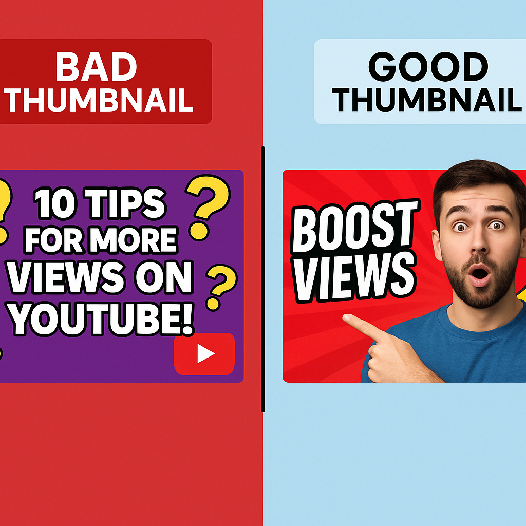
Mistake 4: No Clear Focal Point
When a viewer glances at your thumbnail for a fraction of a second, what do they see first? If their eyes don’t know where to land, they will move on.
- The Problem: The thumbnail is a chaotic jumble of different elements with no clear subject.
- The Fix: Create a single, obvious focal point. A close-up of a human face showing emotion is the most powerful tool. If not a face, use a single, large object that is central to your video’s topic.
Mistake 5: Inconsistent Branding
Your thumbnails are an opportunity to build a recognizable brand. If every single one looks completely different, viewers won’t be able to spot your content in a crowded subscription feed.
- The Problem: No consistent style, color palette, font, or logo placement.
- The Fix: Develop a simple template. This could mean always placing your logo in the same corner, using the same 2-3 brand colors, or using a consistent font for every video. Consistency builds familiarity and trust.
Mistake 6: Not Analyzing Your Competition
Designing in a vacuum is a recipe for failure. You need to know what other successful videos in your niche are doing.
- The Problem: You create a thumbnail without knowing what’s already ranking for your target keyword.
- The Fix: Before you design, search for your video’s topic on YouTube. What do the top 5 thumbnails have in common? What colors are they using? You can either adopt these best practices or, even better, find a way to be deliberately different to stand out. Use a tool like a YouTube Thumbnail Downloader to save these images for a quick side-by-side analysis.
Mistake 7: Misleading Clickbait
Using an image or text that has nothing to do with your video’s content might get you a click, but it will destroy your audience’s trust and your video’s performance. YouTube’s algorithm tracks Audience Retention—if viewers click away in the first few seconds because they feel tricked, YouTube will stop recommending your video.
- The Problem: The thumbnail promises something the video doesn’t deliver.
- The Fix: Be exciting, not dishonest. Your thumbnail should accurately represent the most exciting, valuable, or intriguing part of your video. Create curiosity, but always deliver on your promise.
Conclusion (7 YouTube Thumbnail Mistakes)
Your thumbnails are your channel’s first impression, and getting them right is non-negotiable for growth. By avoiding these common mistakes, you’ll be well on your way to creating professional, clickable visuals that do your great content justice.
Ready to start creating better visuals? Explore Picknar’s suite of free tools designed to help creators succeed!